
Few symbols in global pop culture carry the visual charge of the red, white, and blue globe logo. Over the past century, its silhouette has shifted alongside music movements, graphic design revolutions, and changing soda fountain aesthetics. Tracing its visual history offers a masterclass in how a brand adapts to stay at the center of youth culture.
From Cursive Script to Bottle Cap Symbols
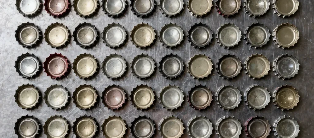
In the early twentieth century, beverages relied on elaborate swooping calligraphy etched directly onto heavy glass bottles. The modern visual identity took a major leap forward during the 1940s when the iconic swirl motif was stamped onto crown metal bottle caps as a patriotic badge. That circular bottle cap shape eventually distilled into the iconic globe emblem recognized across the planet today.
The High-Contrast Electric Era
The 1970s and 1980s ushered in bold geometric lines, neon light fixtures, and high-contrast aluminum can print technique. The logo dynamic wave pattern matched the high-energy pulse of stadium concerts, arcade cabinets, and television spots. Packaging moved away from subtle glass molding in favor of striking visual contrast that commanded attention on grocery store shelves.
The Eternal Appeal of Retro Packaging
Today, retro packaging reissues continue to spark massive fan enthusiasm whenever classic visual layouts return to store shelves. Modern design team updates honor those decades of heritage while sharpening lines for crisp digital screens and sleek matte cans. Whether displayed on a vintage vending machine or a contemporary smartphone screen, the core aesthetic remains timeless.